Plotting focal mechanism 'beachballs' in QGIS
Richard Styron
Cross-posted from the GEM Hazard Blog
One of the major annoyances of working in earthquake and tectonic sciences is the difficulty of browsing earthquake focal mechanism 'beachball' data, and plotting it in GIS. The typical way of displaying this data spatially is to use a script in Matlab (probably using bb.m), Python (using the fantastic ObsPy) or the venerable GMT. All of these methods can produce great-looking plots, and are associated with extremely powerful computing languages and packages for geophysical analysis. However, scripting is an iterative process, so in order to adjust the borders or scale of a map, you go back to the script and change a number instead of zooming/panning with the mouse.
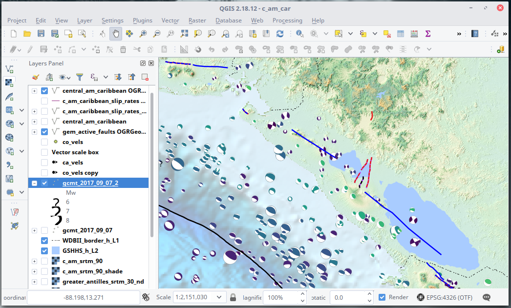
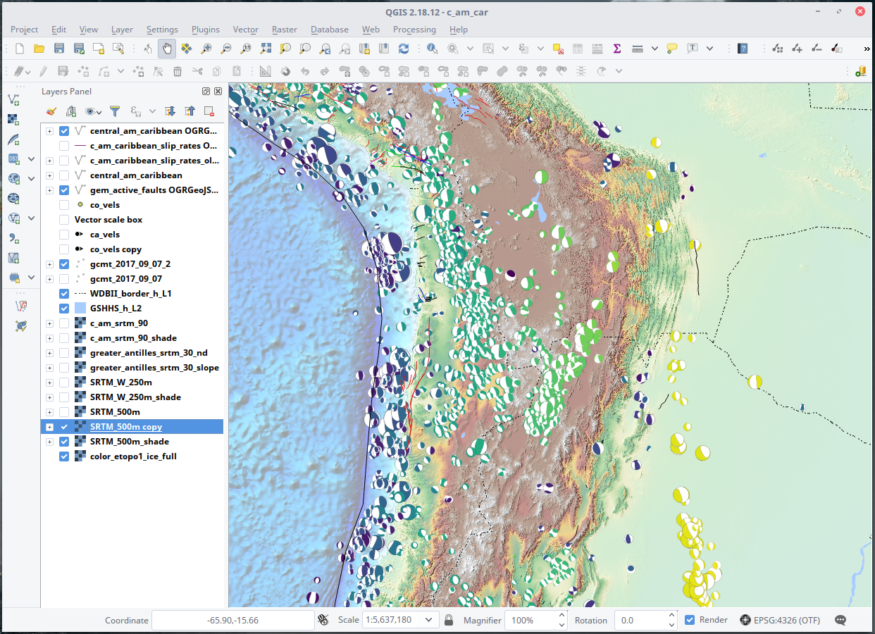 Global CMT events in the South American subduction zone colored by depth
Furthermore, this method is terrible for data discovery. When I am trying to understand the tectonics of a new region, or making fault databases by interpreting 'base datasets' of topography and seismicity as well as the existing work in the literature, I really want to be able to browse a region interactively. Being able to cruise around in GIS or Google Earth, zoom in and out, and click on stuff to see metadata is the fastest way to get acquainted with a region. Or, I am looking for particular signals, such as closely-spaced regions of extension and contraction that may indicate something strange in the neighborhood. Interactive visualization and exploration of focal mechanism data is central to all of this.
I've put a bit of work in the past few years to to meet this need. The first project is an interactive web map, the GCMT Viewer, which generally works (it sometimes crashes and I don't know why), but auto-updates and is very accessible. (Big thanks to the SegFaults crew for the help!)
However, being able to do this visualization and exploration in a GIS is also critical: this is where I map faults, and use other data layers (existing faults, other seismicity, topography data, GPS1 data, etc.). Going back and forth between the GCMT Viewer and the GIS is workable, but kind of a pain. And importantly, you can simply make better maps with GIS than with the scripting languages above, because you have more knobs to turn and a better UI.
I have recently figured out how to plot beachballs in QGIS, which is the GIS that I use2. It's a bit of a pain to do (and unfortunately is punitive in terms of hard drive utilization) but the end result is well worth it for more than very casual use.
I use the Global CMT catalog for my focal mechanisms data habits, because it's high quality, readily available (although in non-ideal formats and who knows about the licensing), and the centroid moment tensor has a more informative location than the hypocenter (such as the NEIC database) because the centroid represents the mean location of energy release instead of the location where slip initiated on a fault (at least this is my understanding of the situation; caveat emptor).
There are several steps here:
- Get the focal mechanism data.
- Make SVG files for each focal mechanism (this is the worst part).
- Load the data in QGIS.
- Change the
Stylesettings to find the icon paths. - (optional) Set min/max map scale limits, change icon size by map scale, etc.
The first two parts aren't really straightforward, but I've written a bit of Python code to automate parts of this. It's not a push-button solution but it's doable. The code is in a GitHub repo called gcmt_utils, and some of the necessary parts are in a separate branch called gem_desktop because it has a bit of stuff specific to doing this task on my workstation, and doesn't need to be merged yet. I will link to the specific files below.
1. Get focal mechanism data
For reasons that are unclear to me, you can't just download the whole GCMT catalog as a CSV file, with all of the metadata. That would make things very easy and very nice. But the GCMT project is generally outstanding (and surely underfunded as these things tend to be) so I don't want to be overly harsh.
Instead I have written two scripts that downloads the separate subcatalogs in the NDK format, which is the most complete, and saves it as a SQLite database (it might have been better to use a different format such as JSON or a Pandas DataFrame but I didn't because I wanted to learn about SQL).
The first script gets the main file and the curated monthly files, and
writes a new SQLite database (the NDK files are loaded into memory as strings
and aren't written to disk). The second script gets the Quick CMT
NDK file and then adds those events to the SQL file. I don't have anything
implemented to filter out the old Quick CMTs when they've been refined and
added to the main database (sorry). You will also have to make sure you have
all of the dependencies installed (including downloading the whole gcmt_utils
repository though you don't need to install it) but I think that's it. (email
me if it's not).
Then, you can dump the SQLite database to CSV to load into QGIS with this one neat trick:
sqlite3 -header -csv gcmt_table.sqlite "select * from GCMT_events;" > gcmt_2017_09_07.csv
HOWEVER: If you don't care about having a super up-to-date dataset all the time, I have also uploaded the entire catalog as an easy-to-use CSV text file that is current as of 07 September 2017. You can download it HERE.
2. Make SVG files
This is the bad part, but it hopefully it doesn't require a ton of work by you the user (as opposed to your CPU).
Unfortunately, though you can use custom markers in QGIS, I don't know if it's
possible to have those markers generated in QGIS based on feature attributes.
Therefore you have to generate the marker files (in .svg format) separately
for each earthquake.
I also have a script for this! This script loads the SQLite
database and iterates over every row, making and saving a beachball to file
using ObsPy, with the event name as the filename. It puts them in
../data/bbs/svg/, so you'll need to make sure that this directory exists or
change this to whatever you want.
It will take hours to run if you're doing the whole catalog, and the resulting directory will take up ~700 MB even though each file is ~15 kB (there are around 44,000 earthquakes). That's not ideal, but I don't know of a way around it. It's also about a median size for a DEM that I use, but it's a hyper-useful global dataset. Science in the early 21st century... get used to it. If you don't want everything, then you can filter the data as you see fit.
Also, a note on the beachball coloring: In this script, I color the T quadrants of the beachballs by log(depth), with a minimum depth of 10 km and maximum of 700 km. I use the viridis color ramp for this, with dark purple as shallow transitioning all the way to light yellow at 700 km. I find this to be incredibly useful. If you don't like this, you'll have to change this line in the script, but for most GIS type use it should be OK.
3. Load data into QGIS
Back onto Easy Street. In the QGIS menu, go to Layer -> Add delimited text
layer... and select the CSV file. You may need to confirm that the data are in
WGS84 coordinates/ EPSG:4326 (i.e., long-lat).
4. Change Style settings
This is also easy, but it's a little arcane (like most good magic).
Right-click on the file in the table of contents, and go to Properties ->
Style and then on the top right panel, make sure that it's set to Single
symbol. Below there will be a box that says Marker and a subitem Simple
marker:
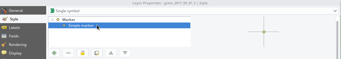
Single symbol marker type
Click on Simple marker, and in the menu below change the Symbol layer type
to SVG marker.
Then, go down to a little menu icon (that always stands for Data defined
override, the best menu ever for scientists, and why QGIS beats ArcMap) next
to the box with the markers for you to choose from:
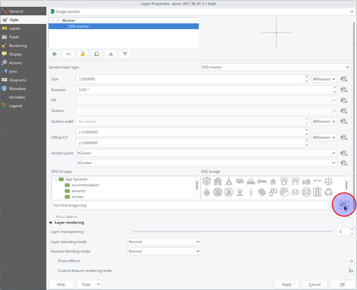 Click on the menu in the red circle.
Then, go to Edit... and another menu pops up, where you can build the
expression that will fetch the SVG files for each earthquake:
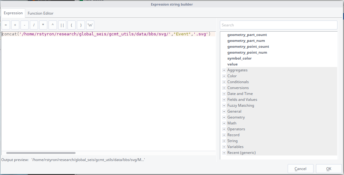
In the box, enter:
concat('/home/rstyron/research/global_seis/gcmt_utils/data/bbs/svg/',"Event",'.svg')
except change /home/rstyron/research/global_seis/gcmt_utils/data/bbs/svg/ to
the full directory path on your computer where these are stored. Then hit
OK, and then Apply in the larger menu.
Now the images will load but they'll be tiny! So we will rescale them. Might as well do it based on magnitude, but you could make them all equal or based on date or whatever your cold little sciencey heart desires.
To do this, with either Marker or SVG marker selected, go to the Size
setting and click on the Data defined override box again, and go to
Edit.... Then, in the Expression box, type:
coalesce(scale_linear( "Mw", 5, 8, 4, 16), 0)
and OK out of that menu, and the next.
Now we're in business! You can play around with the sizes to suit your own purposes.
5. Make scale-dependent styles
However, if you really are going to invest some time in either digging through this data or making a lot of maps, then you may want to get a little more sophisticated with how you plot the data.
I have started applying 'rules' to the data, where there is filtering of smaller events, and changes in the beachball size, depending on the zoom/map scale I'm currently working in.
To do this, change the top-level Style setting to Rule-based. Then, add
rules (in this case filtering), for example by setting "Mw" >- 6.5, and Min.
scale to 1:100,000,000 and Max. scale to 1:10,000,000. This does what
you'd think: at those zoom levels, events with Mw under 6.5 are not
displayed.
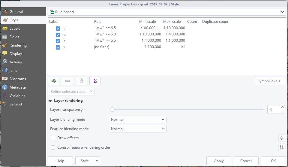 Rules are back in
 Style
It's also helpful to be able to change the size of the beachballs. To do this,
double click on the ? (right of the checkbox on the left), go down to Size,
and modify the sizing as we did earlier. I found it most straightforward to
simply add a linear scaling to the rule we already put in place above:
0.5 * coalesce(scale_linear( "Mw", 5, 8, 4, 16), 0)
(or whatever constant you'd like based on the zoom range). But you could do something completely different.
One improvement to this would be to do something that I did for the GCMT Viewer after being inspired by Google Earth's earthquake display: I implemented an adaptive filter that is based not only on the magnitude but the spatial density of the earthquakes. This way, even when pretty zoomed out, small earthquakes in tectonically quiescent regions are still visible, but the same sized event in a subduction zone wouldn't be. This maximizes the signal-to-noise ratio of the events. However, it took a bit of both coding (I had a separate field in the CMT data table for the filtering index) and calibration (finding the appropriate zoom ranges, densities and magnitude ranges) so I didn't re-implement it here. Yet.
Well, this concludes the tutorial. I hope it's not too scary--it's like an afternoon to a day of work depending on how well set-up your Python environment is and how readily you can do the inevitable tweaking. If you have any questions, please don't hesitate to email me (richard dot h dot styron at gmail dot com).
-
GPS data can be plotted in QGIS particularly well with the excellent Vector Field Renderer plugin. There are probably also good solutions for ArcMap but I don't know them. ↩
-
As a side note, I highly recommend QGIS now even though maybe 5 years ago, I found it to be less usable than ArcMap--not only has it improved quite a bit, but it's cross-platform, has much better support for better data formats (i.e. GeoJSON over ShapeFiles), has a great plugin ecosystem, and it's often an easier, faster and more reproducible workflow to do what can't be easily done in GRASS in Python or Matlab and then import the results into QGIS for finish work and presentation. You can even run scripts from within QGIS (as in Arc) although I rarely do this. ↩